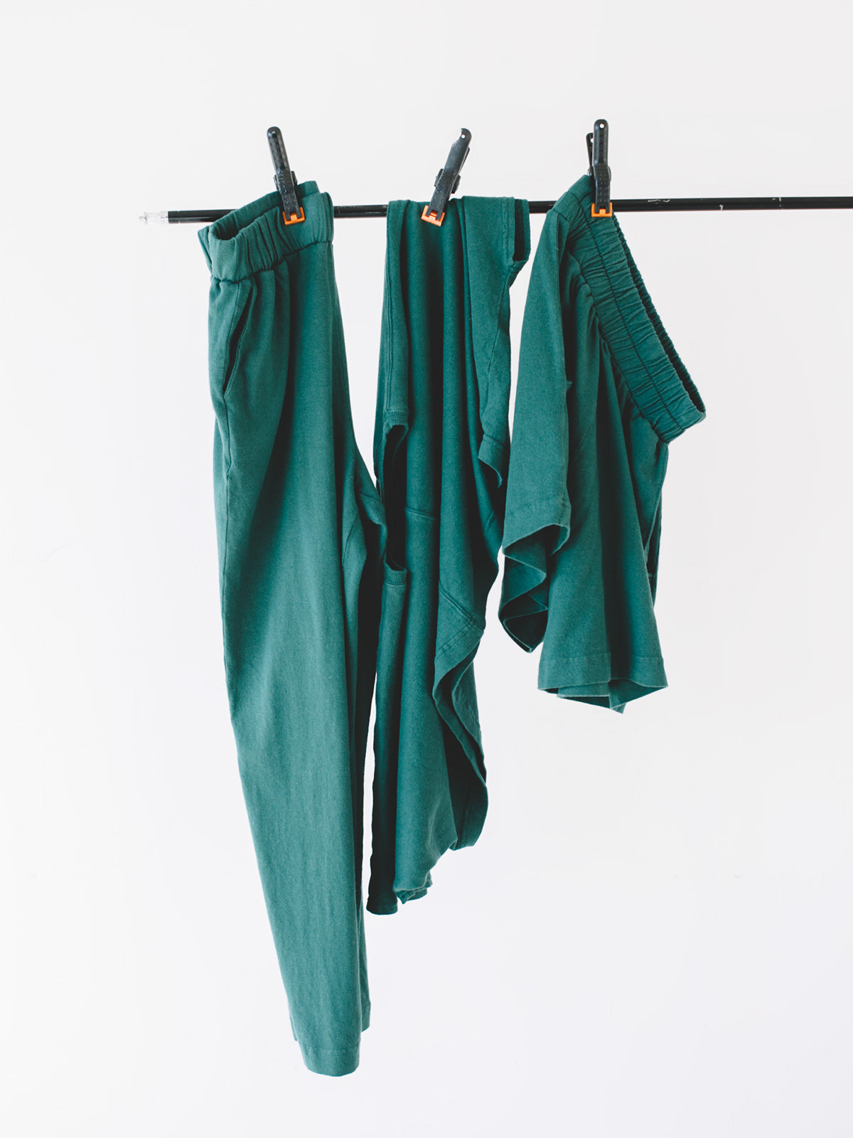
As I go deeper into the design process and finding ways to regulate my nervous system, color is a major player when developing new collections. Chromotherapy or color therapy looks at different ways to stimulate or calm the nervous system through color, influencing our energy, stress, and anxiety levels. When I wake up and feel like the day's going to be a slog, I'll wear red to give me that stimulating boost of energy, and when I feel like I need to focus in, I'll often wear all black, which connects with power and being grounded. Warm colors like orange and red can be more stimulating and help with fatigue while cooler colors like blue and green can soothe and calm your nervous system.
Overall, I prefer cooler tones in my collections with at least one pop of color for that energizing effect. Balance, calmness, grounding, and energy run through my mind as I choose colors within a collection. To keep flow going by challenging myself as a designer, I try to push beyond the palettes I gravitate to by exploring my own relationship with different colors. I would say that at the moment, orange is a harder color for me to experience or wear, although I love seeing it on other people. So as an exercise, I'm paying more attention to orange in my environment to see what shades have more of a therapeutic impact on me somatically.

